Understanding Browser Compatibility: A Comprehensive Guide
Browser compatibility refers to the ability of a website or web application to function correctly across different internet browsers. As the web is accessed through various platforms such as Chrome, Firefox, Safari, and Edge, ensuring compatibility is crucial for delivering a seamless user experience. Each browser interprets HTML, CSS, and JavaScript in unique ways, which can lead to discrepancies in how your content is displayed. To mitigate these issues, developers often employ techniques like feature detection, use of polyfills, and the adoption of responsive design principles.
To achieve optimal browser compatibility, consider following these essential guidelines:
- Utilize standard and well-tested coding practices.
- Regularly test your website on multiple browsers and devices.
- Implement fallbacks for CSS and JavaScript features not supported by all browsers.
- Stay informed about the latest browser updates and their impact on web standards.
Top 10 Tips for Testing Your Website Across Different Browsers
When developing a website, it’s crucial to ensure compatibility across various browsers. Different browsers can render your site differently, leading to potential user experience issues. Here are top 10 tips for testing your website across different browsers:
- Utilize Browser Testing Tools: Leverage tools like BrowserStack or CrossBrowserTesting to simulate how your website behaves on multiple browsers.
- Check for Responsive Design: Ensure your site looks good on various devices by testing on mobile browsers as well.
Continuing with the top 10 tips for testing your website across different browsers, remember to:
- Perform Manual Testing: Always take the time to manually check key features, as automated tests may miss nuanced issues.
- Stay Updated: Ensure your browser versions are up to date, as older versions may display unexpected errors.
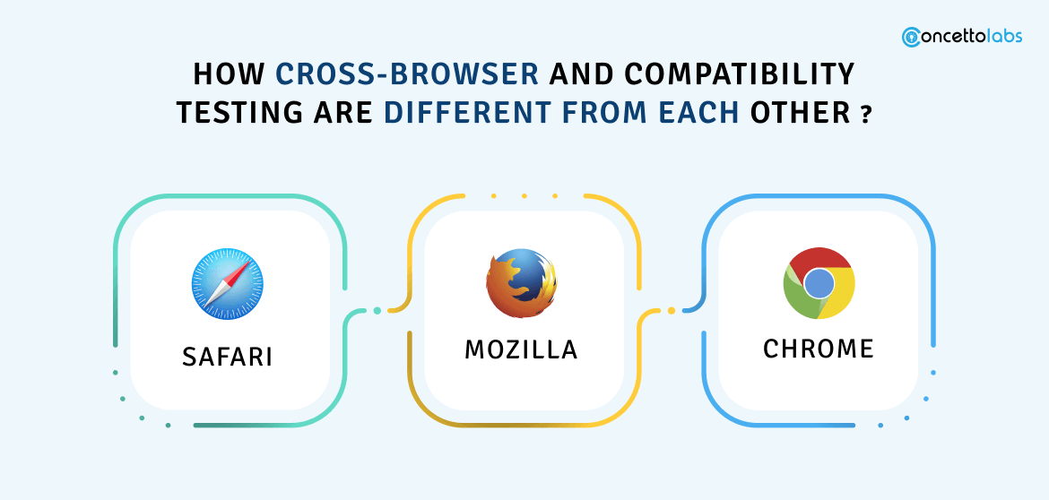
Why Does My Website Look Different on Chrome vs. Firefox?
Many web developers and users often notice that their websites can appear differently across various browsers like Chrome and Firefox. This discrepancy can be attributed to a few key factors including rendering engines, CSS compatibility, and JavaScript execution. Each browser utilizes its own rendering engine—Chrome uses Blink while Firefox employs Gecko. These engines interpret HTML, CSS, and JavaScript in subtly different ways, leading to variations in layout, spacing, and even functionality. Additionally, certain CSS properties or JavaScript functions may be supported in one browser but not in another, which can further exacerbate the differences in appearance.
Another aspect to consider is how each browser handles web standards and updates. While browsers strive to adhere to established web standards, there are often minor inconsistencies. For instance, features like flexbox or grid layout can render with slight variations between Chrome and Firefox. It's also important to remember that browser settings, extensions, and updates may influence appearance. To ensure uniformity in how your website looks across different browsers, it's advisable to conduct thorough testing and make use of cross-browser compatibility tools to identify and resolve any layout issues.